MOVIE SET MONDAY
Welcome back to Movie Set Monday! I am still having the most fun putting these posts together. Interior design and home decor really are some of my passions. I may not always be great at putting it together myself, but I love to look at spaces that have been expertly styled. I learn so much from them. And that’s no exception today.
SEX AND THE CITY 2
In the second movie of the Sex and the City franchise we see that Carrie and Big decided not to live in the beautiful 5th Avenue penthouse we saw in the first movie (that post here), but they did get a stunning apartment that we’re going to look at today. 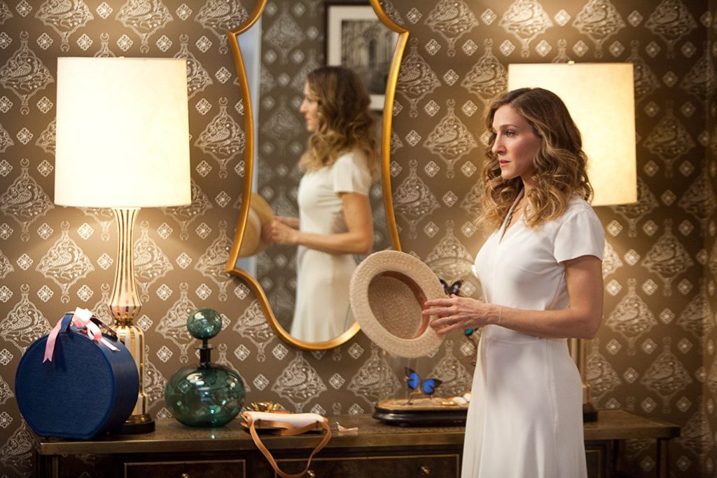 I’m a sucker for wallpaper. I know that many people, my parents included, have probably sworn off wallpaper after scraping some from the 80s or 90s off walls and ceilings. Yes, ceilings. There was pineapple wallpaper on the ceiling of my parents’ kitchen when we first moved into that house. Nowadays we have things like removable wallpaper, so if we want to try a bold pattern on the walls, we won’t feel so bad about taking it down in a few years when the trend is over. I very seriously thought about doing wallpaper in our bathroom, but I think, based on my budget, I’d better stick to paint.
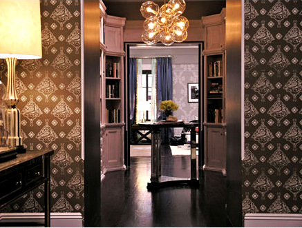 Okay, back to Casa de Preston. I love a foyer with a table in the middle. I guess that room looks as if it’s technically serving as a mini library, but the table right in the center is one of my favorite ways to style a space like that. It’s the perfect excuse for fresh flowers. And that light fixture is just perfection. I am loving interesting light fixtures more and more lately. This bubbly one is very chic.
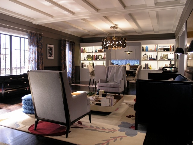 Moving into the living room brings that beautiful ceiling. I love architectural details. That’s what really gives a home it’s character. Another thing I love about this space (because it feels like it’s breaking the “rules” a little bit) is that light fixture. I can’t quite figure out if it’s wooden medallions or bronze ones or maybe brass? Anyway, I think it’s very interesting, but I also like that it’s not centered over the table or the center of the living room. It’s just right in between the two spaces looking pretty.
 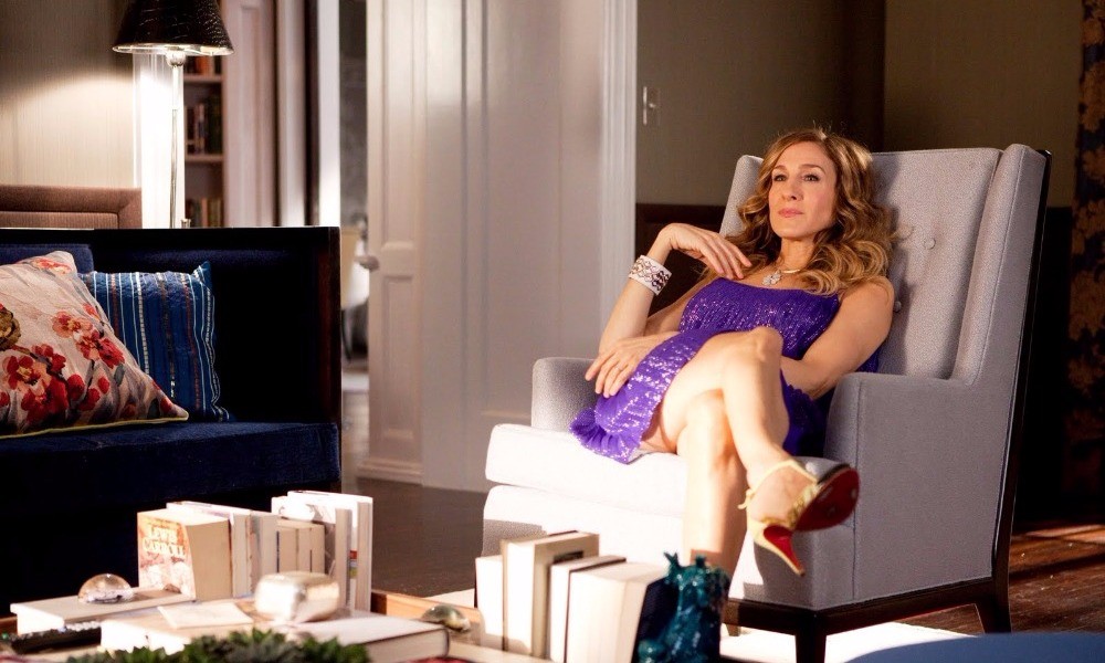 What a great idea to store your books upright on the coffee table? I never would have thought to do this. See-I’m always learning things. And an added bonus to doing this is the great bookends you get to use.
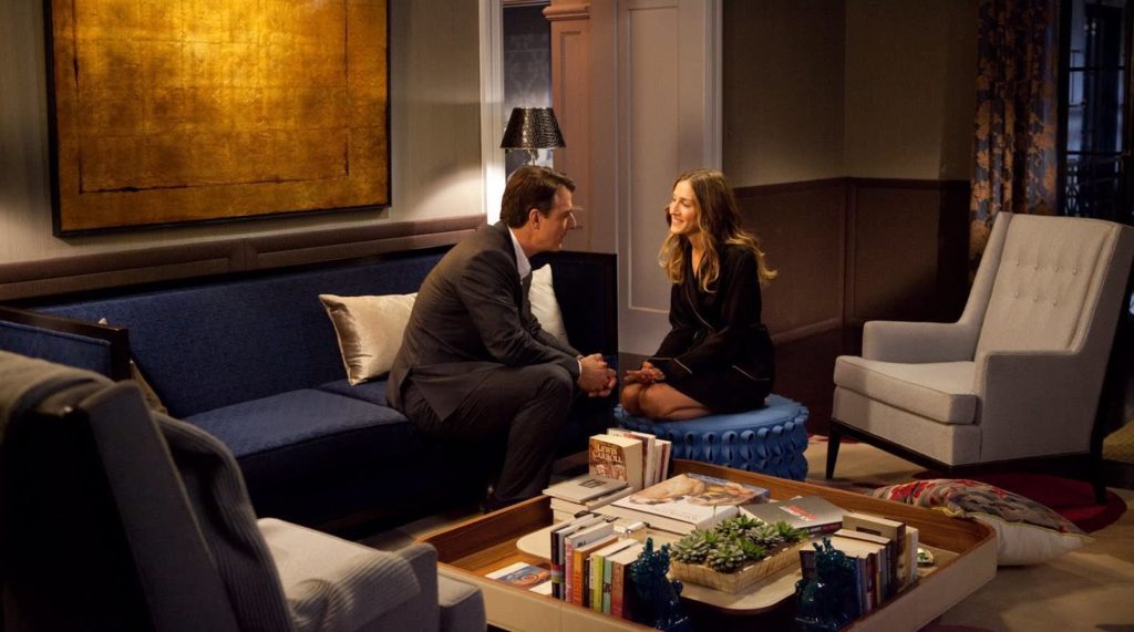 I notice that Carrie must really like the color blue. Remember the last apartment was all bright and, I feel like, quintessentially Single Carrie. But as she and Big got married and have merged their lives together into one space, she didn’t forget her favorite color. (Just wait for the kitchen backsplash.) She just used it in different shades. The whole apartment is covered in different shades of blue. In the picture above there’s the navy couch, the cornflower blue ottoman, and the teal Foo Dog bookends.
 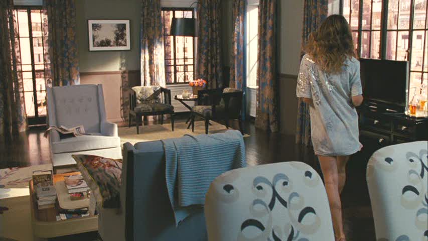 And then those drapes. They cover the room in yet another shade of blue, and it all just works. Here’s another lesson I’ve learned in home decor: It’s okay to mix patterns and prints…as long as you have a color that brings them together to help the space make sense. Nearly every piece in this living and dining space is a neutral or has some shade of blue.
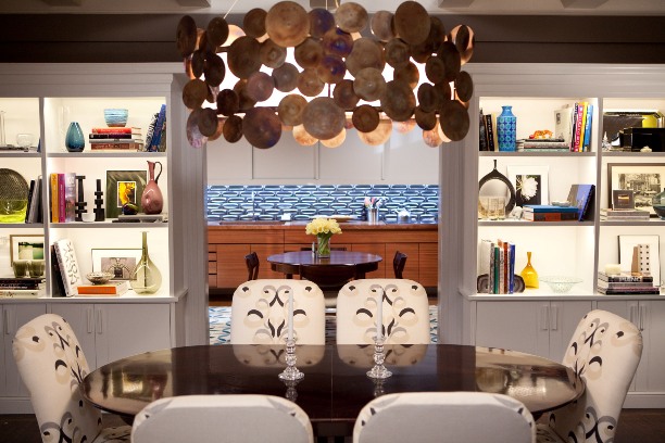
Another light fixture I love is that lamp below. I am definitely a fan of the curved lamp stand. You have to look carefully, but you’ll see the black swan-like neck of the lamp’s stand, and she’s lovely. Way more fun than a traditional table lamp. 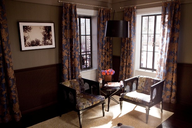 I’m digging the open floor plan and really loving those built-ins. The lights inside each shelf that illuminates them from within is so pretty and really showcases what you’ve got on the shelves. We also get a glimpse of that wild kitchen. Hello, Carrie’s apartment shade of blue. 🙂
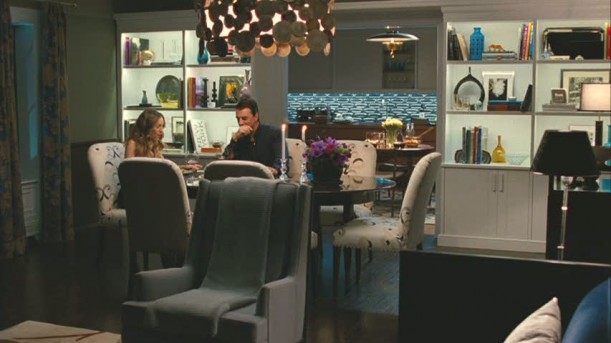 I really love these chairs. The shape, the pattern, everything. And see the light? Is it wood? Is it brass? Is it bronze? Whatever it is, it’s pretty.
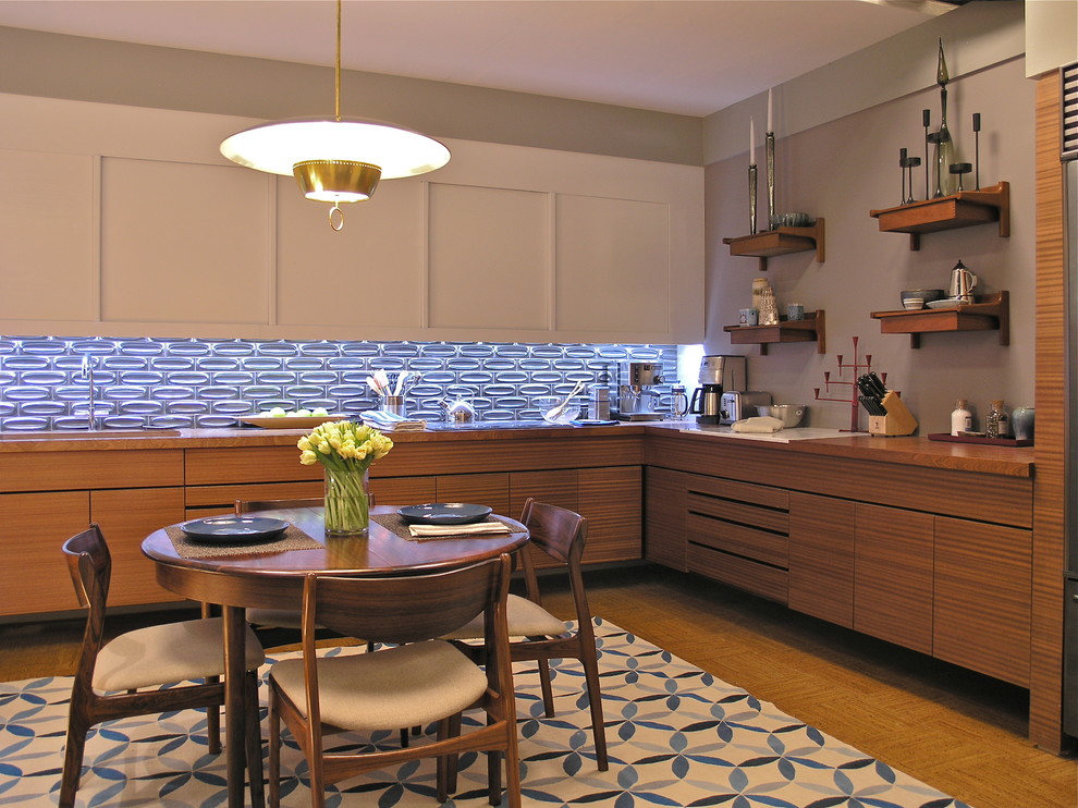
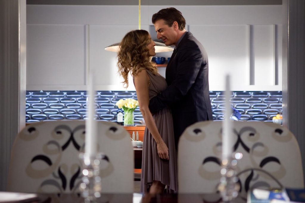 The kitchen almost feels a little retro to me. Maybe it’s the tile backsplash (feels a little sixties mod) or the light (a little bit 50s). Maybe it’s the color of the wood on the lower cabinets that reminds me of some of the movies made/set in the 70s. Or the style of the table and chairs. Or the lack of hardware on any of the cupboards. I do love the big rug in the middle of the kitchen. It’s so unexpected. Again, breaking those rules.
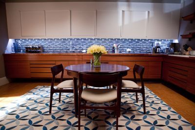 The open shelving is really nice, and it appears the fridge is just to the right of it. I also really love the floors.
  When I first saw this movie and they finally arrived home from Stanford’s and Anthony’s wedding, this was the room that had my heart all aflutter. The wallpaper was speaking my language and then I saw it mixed with the patterned headboard and those inky blue drapes with the gold fringe trim. Yes! Yes! Yes!
  Another master with a sitting area. I fell in love with the idea when I was putting together the Something’s Gotta Give post, and there’s no exception this time either. I love this little space. I could think of so many things to do in a sitting area in my bedroom. I may need to make this happen…
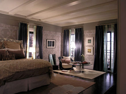 Also, the drapes on every window a real statement. They are so beautiful. Window treatments are like the perfect piece of jewelry to a room. It just adds a finishing touch that nothing else could accomplish. My mom always says curtains makes a room feel “homey”. I agree. I think they are inviting, and I think I want to plop right there in the seat by the window and have a cup of coffee and read a fashion magazine as Carrie would.
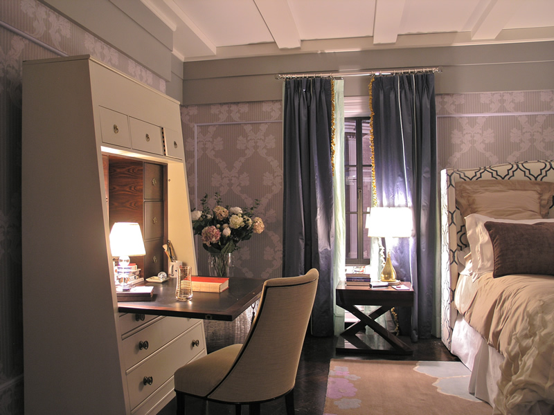
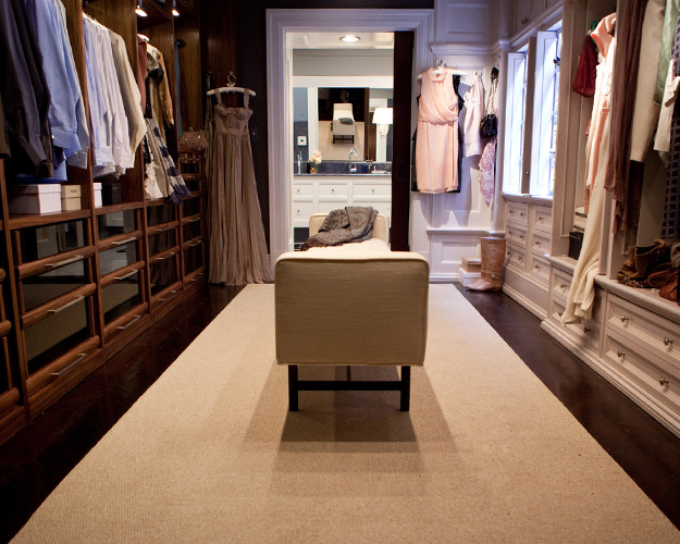
Or perhaps I’d sit at this lovely desk next to that window and write more about this glorious NYC apartment. 🙂 What a gorgeous piece of furniture, right? I love it’s shape and that wood grain on the inside is so pretty. 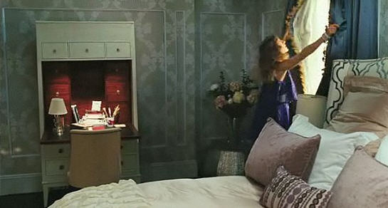 Well we’ve come to the end. Just like the last SATC set post, I’ll leave you with a view of the perfect closet. His and hers. Again, I love that it’s perfectly imperfect and breaks the rules of symmetry, which I actually happen to love, but this is custom perfection. His is warm and masculine, and hers is light and feminine. And it’s wide enough for a place to sit and fasten your strappy sandals or zip up your boots or tie up your sneakers. And of course she’s still displaying her fabulous clothes as art.
  Thanks for coming back to Movie Set Monday. Same time, same place next week, right?


 I’m a sucker for wallpaper. I know that many people, my parents included, have probably sworn off wallpaper after scraping some from the 80s or 90s off walls and ceilings. Yes, ceilings. There was pineapple wallpaper on the ceiling of my parents’ kitchen when we first moved into that house. Nowadays we have things like removable wallpaper, so if we want to try a bold pattern on the walls, we won’t feel so bad about taking it down in a few years when the trend is over. I very seriously thought about doing wallpaper in our
  Okay, back to Casa de Preston. I love a foyer with a table in the middle. I guess that room looks as if it’s technically serving as a mini library, but the table right in the center is one of my favorite ways to style a space like that. It’s the perfect excuse for fresh flowers. And that light fixture is just perfection. I am loving interesting light fixtures more and more lately. This bubbly one is very chic.
 Moving into the living room brings that beautiful ceiling. I love architectural details. That’s what really gives a home it’s character. Another thing I love about this space (because it feels like it’s breaking the “rules” a little bit) is that light fixture. I can’t quite figure out if it’s wooden medallions or bronze ones or maybe brass? Anyway, I think it’s very interesting, but I also like that it’s not centered over the table or the center of the living room. It’s just right in between the two spaces looking pretty.
  What a great idea to store your books upright on the coffee table? I never would have thought to do this. See-I’m always learning things. And an added bonus to doing this is the great bookends you get to use.
 I notice that Carrie must really like the color blue. Remember the last apartment was all bright and, I feel like, quintessentially Single Carrie. But as she and Big got married and have merged their lives together into one space, she didn’t forget her favorite color. (Just wait for the kitchen backsplash.) She just used it in different shades. The whole apartment is covered in different shades of blue. In the picture above there’s the navy couch, the cornflower blue ottoman, and the teal Foo Dog bookends.
  And then those drapes. They cover the room in yet another shade of blue, and it all just works. Here’s another lesson I’ve learned in home decor: It’s okay to mix patterns and prints…as long as you have a color that brings them together to help the space make sense. Nearly every piece in this living and dining space is a neutral or has some shade of blue.
 I’m digging the open floor plan and really loving those built-ins. The lights inside each shelf that illuminates them from within is so pretty and really showcases what you’ve got on the shelves. We also get a glimpse of that wild kitchen. Hello, Carrie’s apartment shade of blue. 🙂
 I really love these chairs. The shape, the pattern, everything. And see the light? Is it wood? Is it brass? Is it bronze? Whatever it is, it’s pretty.
 The kitchen almost feels a little retro to me. Maybe it’s the tile backsplash (feels a little sixties mod) or the light (a little bit 50s). Maybe it’s the color of the wood on the lower cabinets that reminds me of some of the movies made/set in the 70s. Or the style of the table and chairs. Or the lack of hardware on any of the cupboards. I do love the big rug in the middle of the kitchen. It’s so unexpected. Again, breaking those rules.
 The open shelving is really nice, and it appears the fridge is just to the right of it. I also really love the floors.
  When I first saw this movie and they finally arrived home from Stanford’s and Anthony’s wedding, this was the room that had my heart all aflutter. The wallpaper was speaking my language and then I saw it mixed with the patterned headboard and those inky blue drapes with the gold fringe trim. Yes! Yes! Yes!
  Another master with a sitting area. I fell in love with the idea when I was putting together the
  Also, the drapes on every window a real statement. They are so beautiful. Window treatments are like the perfect piece of jewelry to a room. It just adds a finishing touch that nothing else could accomplish. My mom always says curtains makes a room feel “homey”. I agree. I think they are inviting, and I think I want to plop right there in the seat by the window and have a cup of coffee and read a fashion magazine as Carrie would.
 Well we’ve come to the end. Just like the last
  Thanks for coming back to Movie Set Monday. Same time, same place next week, right?